(Note 2026-09-02: This is a technical archive from 2019. The interfaces, prices, instance types, operating systems, packages and authentication methods are described as they existed when the article was published. The sections on Google Compute Engine and sending email should not be followed as current instructions.)
Welcome to the article containing the technical details from my Web à Québec talk. We will code together so Bob can stop spending hours every month repeating the same operations in Excel and use his time for more productive work.
Context for the code example
This example uses real 2017 data from the Google Merchandise Store Demo Account and a heavily modified file from Kaggle. Every step used to create these files is detailed in my other article about preparing the data in R. Unfortunately, confidentiality made this the only way to create a public example because very little real transactional data is publicly available.
A reminder of the assignment
Bob is a hard-working business analyst. In addition to his regular work, he spends one day each month collecting, cleaning, analyzing and formatting data so he can give the executives at his company a 15-minute presentation on the performance of its online and physical stores.
He has spent two years presenting the same data in the same way. That means he has spent 192 hours, or 24 eight-hour days, repeating the same tasks to present data for a total of six hours, across 24 presentations of 15 minutes each. Bob thinks there must be a better use of his time. He is right!
Solution
Bob decides to learn the R programming language on DataCamp. He plans to study for one hour a day by waking up one hour earlier each morning. He figures that within a year, after 250 hours of practice, one hour a day, five days a week, 50 weeks a year, he will be able to use the language to free up his time. He is right.
Here is what he can do after 250 hours of practice. It is January 1, 2018, and Bob decides to use the time he once spent producing his report by hand to create visualizations based on the best principles of data communication.
Importing and cleaning the data
# Bob begins by loading the packages he needs.

# readr loads files quickly and easily.
library(readr)

# tidyverse is a collection of packages that makes tidy data easier to work with.
library(tidyverse)

# lubridate makes dates easier to work with.
library(lubridate)

# ggthemes provides preset chart styles.
library(ggthemes)

# scales controls how numbers are displayed in a visualization.
library(scales)

# extrafont manages fonts.
library(extrafont)

# Bob also sets the date locale so dates appear in English.
Sys.setlocale("LC_TIME", "English")
Here are the DataCamp courses for these packages.
Bob now reads his files and converts them into R objects. In production, they would be loaded through an API or data connector. To keep this example simple, Bob reads local files from his hard drive.
The files used in this example are available on Kaggle.
# Read the files
Online <- read_csv("Online.csv", col_types = cols(Date = col_date(format = "%Y%m%d")))
Retail <- read_csv("Retail.csv", col_types = cols(InvoiceDate = col_date(format = "%Y-%m-%d")))

# Bob inspects the file structure to guide his next operations.
glimpse(Online)

## Observations: 54,144
## Variables: 10
## $ `Transaction ID`                         <dbl> 48497, 48496, 48495, ...
## $ Date                                     <date> 2017-12-31, 2017-12-...
## $ `Product SKU`                            <chr> "GGOENEBQ079099", "GG...
## $ Product                                  <chr> "Nest® Protect Smoke ...
## $ `Product Category (Enhanced E-commerce)` <chr> "Nest-USA", "Nest-USA...
## $ Quantity                                 <dbl> 4, 5, 1, 1, 1, 3, 1, ...
## $ `Avg. Price`                             <dbl> 80.52, 80.52, 151.88,...
## $ Revenue                                  <dbl> 316.00, 395.00, 149.0...
## $ Tax                                      <dbl> 34.44, 33.14, 12.06, ...
## $ Delivery                                 <dbl> 19.99, 6.50, 6.50, 6....

glimpse(Retail)

## Observations: 181,247
## Variables: 4
## $ InvoiceNo   <dbl> 536598, 536598, 536598, 536599, 536599, 536600, 53...
## $ InvoiceDate <date> 2017-01-01, 2017-01-01, 2017-01-01, 2017-01-01, 2...
## $ StockCode   <dbl> 21421, 21422, 22178, 20749, 21056, 21730, 21871, 2...
## $ Quantity    <dbl> 1, 2, 26, 2, 2, 2, 1, 1, 1, 1, 1, 1, 1, 60, 2, 1, ...
Bob notices that the Retail file, which contains physical-store sales, is not very complete compared with the Online file. He would like to add product information, selling prices and categories to Retail. The product codes are different too! He will therefore need to create a key between the Product SKU in the Online file and the StockCode in the Retail file.
Bob looks for a StockCode to product-name list, but unfortunately his company never thought to create one, which makes you wonder how it is still in business! Working within those constraints means creating a key file that connects each SKU with a StockCode. Bob asks his intern, Gérard, to match the 1,178 Product SKUs with the 1,178 StockCodes. After thinking long and hard about his career choice, Gérard delivers the following file:
KEY_SKU <- read_csv("KEY_SKU.csv")

glimpse(KEY_SKU)

## Observations: 1,178
## Variables: 2
## $ `Product SKU` <chr> "GGOENEBQ079099", "GGOENEBQ079199", "GGOENEBQ084...
## $ StockCode     <dbl> 21421, 21422, 22178, 20749, 21056, 21730, 21871,...
This is the correspondence between every StockCode and its Product SKU. With this key, we can take information from the Online file and apply it to the Retail file.
First, we create a file listing the information we want for each SKU: product name, category and price.
# Create a logical vector identifying duplicated SKUs, then add it as a new column in Online.
Online$dups <- duplicated(Online$`Product SKU`)

# Retain only non-duplicated rows.
Product_list <- Online %>% filter(dups == FALSE)

# Retain only the relevant information.
Product_list <- Product_list[c("Product SKU", "Product", "Product Category (Enhanced E-commerce)", "Avg. Price")]

# Add the stock code to the product list.
Product_list <- left_join(KEY_SKU, Product_list, by = "Product SKU")

# The complete product list is ready!
glimpse(Product_list)

## Observations: 1,178
## Variables: 5
## $ `Product SKU`                            <chr> "GGOENEBQ079099", "GG...
## $ StockCode                                <dbl> 21421, 21422, 22178, ...
## $ Product                                  <chr> "Nest® Protect Smoke ...
## $ `Product Category (Enhanced E-commerce)` <chr> "Nest-USA", "Nest-USA...
## $ `Avg. Price`                             <dbl> 80.52, 80.52, 151.88,...

# Remove the dups column from Online.
Online$dups <- NULL

# Add all the information to Retail.
Retail <- merge(Retail, Product_list, by = "StockCode", all.x = TRUE)
Retail <- arrange(Retail, InvoiceDate, InvoiceNo)

# Calculate the remaining missing information, revenue and tax, beginning at the line level.
perLine <- Retail %>% mutate(RevenuePerLine = Quantity * `Avg. Price`, TaxPerLine = RevenuePerLine * 0.14975)

# Group the lines by invoice number.
perInvoiceNo <- perLine %>% group_by(InvoiceNo) %>% summarise(Revenue = sum(RevenuePerLine), Tax = sum(TaxPerLine))

# Join this information to our data.
Retail <- merge(Retail, perInvoiceNo, all.x = TRUE)

# Round the tax amount.
Retail$Tax <- round(Retail$Tax, digits = 2)

# Add delivery fees of zero.
Retail <- Retail %>% mutate(Delivery = 0)

# Remove StockCode and work only with Product SKU.
Retail$StockCode <- NULL

# Retail now contains all the information available in Online!
glimpse(Online)

## Observations: 54,144
## Variables: 10
## $ `Transaction ID`                         <dbl> 48497, 48496, 48495, ...
## $ Date                                     <date> 2017-12-31, 2017-12-...
## $ `Product SKU`                            <chr> "GGOENEBQ079099", "GG...
## $ Product                                  <chr> "Nest® Protect Smoke ...
## $ `Product Category (Enhanced E-commerce)` <chr> "Nest-USA", "Nest-USA...
## $ Quantity                                 <dbl> 4, 5, 1, 1, 1, 3, 1, ...
## $ `Avg. Price`                             <dbl> 80.52, 80.52, 151.88,...
## $ Revenue                                  <dbl> 316.00, 395.00, 149.0...
## $ Tax                                      <dbl> 34.44, 33.14, 12.06, ...
## $ Delivery                                 <dbl> 19.99, 6.50, 6.50, 6....

glimpse(Retail)

## Observations: 181,247
## Variables: 10
## $ InvoiceNo                                <dbl> 536598, 536598, 53659...
## $ InvoiceDate                              <date> 2017-01-01, 2017-01-...
## $ Quantity                                 <dbl> 1, 2, 26, 2, 2, 2, 1,...
## $ `Product SKU`                            <chr> "GGOENEBQ079099", "GG...
## $ Product                                  <chr> "Nest® Protect Smoke ...
## $ `Product Category (Enhanced E-commerce)` <chr> "Nest-USA", "Nest-USA...
## $ `Avg. Price`                             <dbl> 80.52, 80.52, 151.88,...
## $ Revenue                                  <dbl> 4190.44, 4190.44, 419...
## $ Tax                                      <dbl> 627.52, 627.52, 627.52, ...
## $ Delivery                                 <dbl> 0, 0, 0, 0, 0, 0, 0, ...
The last step before our analysis and visualizations is to join the two tables.
# Rename the columns so both tables use the same names. This will make our lives easier.
Retail <- Retail %>% rename("Transaction ID" = "InvoiceNo", "Date" = "InvoiceDate")

# Add a categorical column to each table.
Retail$Channel <- "Retail"
Online$Channel <- "Online"

# Join the tables.
Full <- bind_rows(Online, Retail)

# The complete table is ready!
Data analysis
Now that all the data has been combined, it is easy to produce descriptive statistics with base R functions and dplyr’s group_by(), filter() and summarize() functions.
# Example: calculate total annual revenue by sales channel, Online or Retail.
Full_unique <- Full %>%
  distinct(Channel, `Transaction ID`, .keep_all = TRUE)

Revenue_by_channel <- Full_unique %>%
  group_by(Channel) %>%
  summarize(sum(Revenue))

Revenue_by_channel

## # A tibble: 2 x 2
##   Channel `sum(Revenue)`
##   <chr>            <dbl>
## 1 Online        4743705.
## 2 Retail       19019265.
Let’s review the information we want to obtain and present in our report:
- Monthly revenue by category
- Month-over-month growth by category
- Sales forecast for the next month
- Sales forecast scenarios based on the marketing budget
We will produce and visualize each one. Let’s begin by creating a revenue summary by channel, category and month.
(Note 2026-09-02: Deduplication retains a single row per transaction. This is appropriate only if Revenue represents a transaction total repeated on every row. Product- or category-level results should be considered illustrative until revenue has been validated or reconstructed at the product-line level.)
Monthly revenue by category
# Create the Month-Year column that will serve as a grouping factor.
Full_unique$Mois_An <- format(as.Date(Full_unique$Date), "%Y-%m")

# Convert categorical vectors to factors.
Full_unique$`Product Category (Enhanced E-commerce)` <- as.factor(Full_unique$`Product Category (Enhanced E-commerce)`)
Full_unique$Mois_An <- as.factor(Full_unique$Mois_An)
Full_unique$Channel <- as.factor(Full_unique$Channel)

# Create the sales summary by channel, month and category.
Full_summary <- Full_unique %>%
  group_by(Channel, Mois_An, `Product Category (Enhanced E-commerce)`, .drop = FALSE) %>%
  summarize(sum(Revenue))

# Replace uncategorized sales with an Other category.
Full_summary$`Product Category (Enhanced E-commerce)` <- as.character(Full_summary$`Product Category (Enhanced E-commerce)`)

Full_summary$`Product Category (Enhanced E-commerce)` <- Full_summary$`Product Category (Enhanced E-commerce)` %>% replace_na("Other")

Full_summary$`Product Category (Enhanced E-commerce)` <- as.factor(Full_summary$`Product Category (Enhanced E-commerce)`)
Now that we have summarized sales by channel, category and month, we can begin creating our visualizations.
# Initialize the date. In a real setting we would use Sys.Date(), but here we use a fixed date for the example.

sysdate <- as.Date(ymd_hms("2018-01-01 9:00:00"))

# Visualize sales for the latest month by category.
ggplot(data = filter(Full_summary, Mois_An == format(as.Date(sysdate %m+% months(-1)), "%Y-%m")), aes(x = reorder(`Product Category (Enhanced E-commerce)`, `sum(Revenue)`), y = `sum(Revenue)`, fill = Channel)) +
  geom_col(position = "stack") +
  coord_flip() +
  theme_tufte() +
  theme(legend.position = c(0.8, 0.15)) +
  scale_fill_manual(values = c("#2c7bb6", "#abd9e9")) +
  scale_y_continuous(labels = dollar) +
  theme(axis.title.x = element_text(family = "Arial", colour="#484848", size=12),
        axis.text.x  = element_text(family = "Arial", colour="#484848", size=12),
        axis.title.y = element_blank(),
        axis.text.y  = element_text(family = "Arial", colour="#484848", size=12),
        legend.title = element_text(family = "Arial", colour="#484848", size=10),
        legend.text  = element_text(family = "Arial", colour="#484848", size=9),
        plot.title   = element_text(family = "Arial", colour="#484848", size=16),
        plot.subtitle = element_text(family = "Arial", colour="#484848", size=10)) +
  labs(y = "Revenue ($)",
       title = "Sales by category and channel",
       subtitle = format(as.Date(sysdate %m+% months(-1)), "%B %Y"),
       fill = "Channel")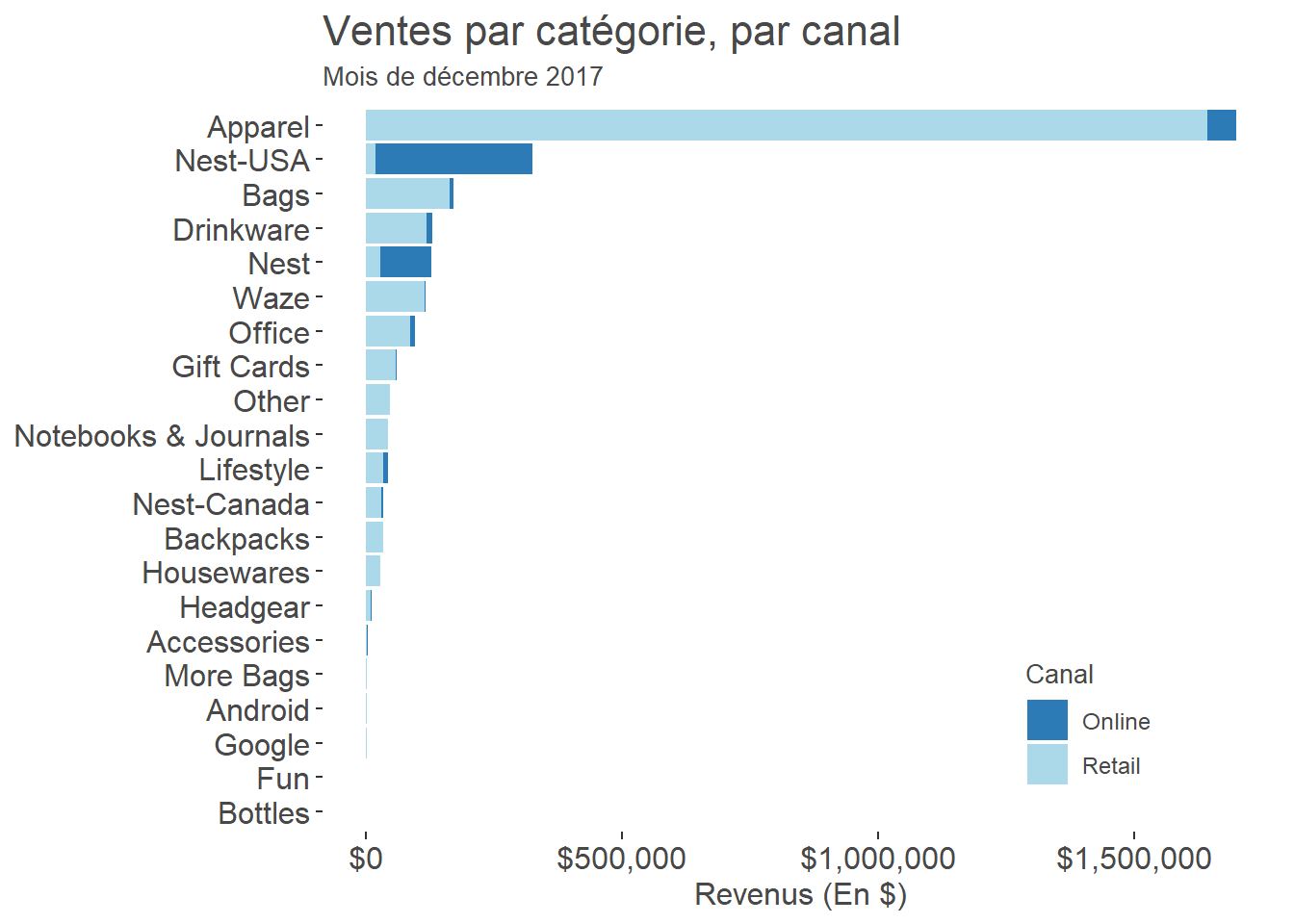
We now want to calculate sales growth by category for the latest complete month compared with the preceding month.
(Note 2026-09-02: The calculation below reverses the sign of growth. Positive values therefore represent declines, while negative values represent increases. Both charts retain the result as it was published in 2019.)
# Calculate sales growth for the latest month, December, compared with the previous month, November.
Summary_current <- Full_summary %>% filter(Mois_An == format(as.Date(sysdate %m+% months(-1)), "%Y-%m"))
Summary_previous <- Full_summary %>% filter(Mois_An == format(as.Date(sysdate %m+% months(-2)), "%Y-%m"))
Summary_current$Growth <- (Summary_previous$`sum(Revenue)` - Summary_current$`sum(Revenue)`) / Summary_previous$`sum(Revenue)` * 100

#
Summary_current[is.na(Summary_current)] <- NA
Summary_current$Growth[is.infinite(Summary_current$Growth)] <- NA

# Visualize online sales growth for the latest month by category.
ggplot(data = filter(Summary_current, Channel == "Online" & !is.na(Growth)), aes(x = reorder(`Product Category (Enhanced E-commerce)`, Growth), y = Growth, fill = Growth > 0)) +
  geom_col() +
  coord_flip(ylim = c(-100, 100)) +
  theme_tufte() +
  theme(axis.title.x = element_text(family = "Arial", colour="#484848", size=12),
        axis.text.x  = element_text(family = "Arial", colour="#484848", size=12),
        axis.title.y = element_blank(),
        axis.text.y  = element_text(family = "Arial", colour="#484848", size=12),
        plot.title   = element_text(family = "Arial", colour="#484848", size=16),
        plot.subtitle = element_text(family = "Arial", colour="#484848", size=10),
        legend.position = "none"
        ) +
  labs(y = "MoM change (%)",
       title = "Monthly change in online sales",
       subtitle = (paste(format(as.Date(sysdate %m+% months(-1)), "%B %Y"), "compared with", format(as.Date(sysdate %m+% months(-2)), "%B %Y"), sep = " "))) +
       scale_fill_manual(values=c("FALSE"= "#fdae61", "TRUE" = "#abd9e9"))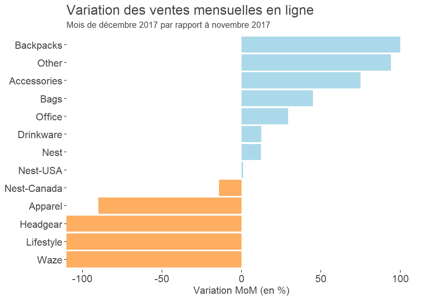
# Visualize physical-store sales growth for the latest month by category.
ggplot(data = filter(Summary_current, Channel == "Retail" & !is.na(Growth)), aes(x = reorder(`Product Category (Enhanced E-commerce)`, Growth), y = Growth, fill = Growth > 0)) +
  geom_col()+
  coord_flip(ylim = c(-100, 100)) +
  theme_tufte() +
  theme(axis.title.x = element_text(family = "Arial", colour="#484848", size=12),
        axis.text.x  = element_text(family = "Arial", colour="#484848", size=12),
        axis.title.y = element_blank(),
        axis.text.y  = element_text(family = "Arial", colour="#484848", size=12),
        plot.title   = element_text(family = "Arial", colour="#484848", size=16),
        plot.subtitle = element_text(family = "Arial", colour="#484848", size=10),
        legend.position = "none"
        ) +
  labs(y = "MoM change (%)",
       title = "Monthly change in physical-store sales",
       subtitle = (paste(format(as.Date(sysdate %m+% months(-1)), "%B %Y"), "compared with", format(as.Date(sysdate %m+% months(-2)), "%B %Y"), sep = " "))) +
       scale_fill_manual(values=c("FALSE"= "#fdae61", "TRUE" = "#abd9e9"))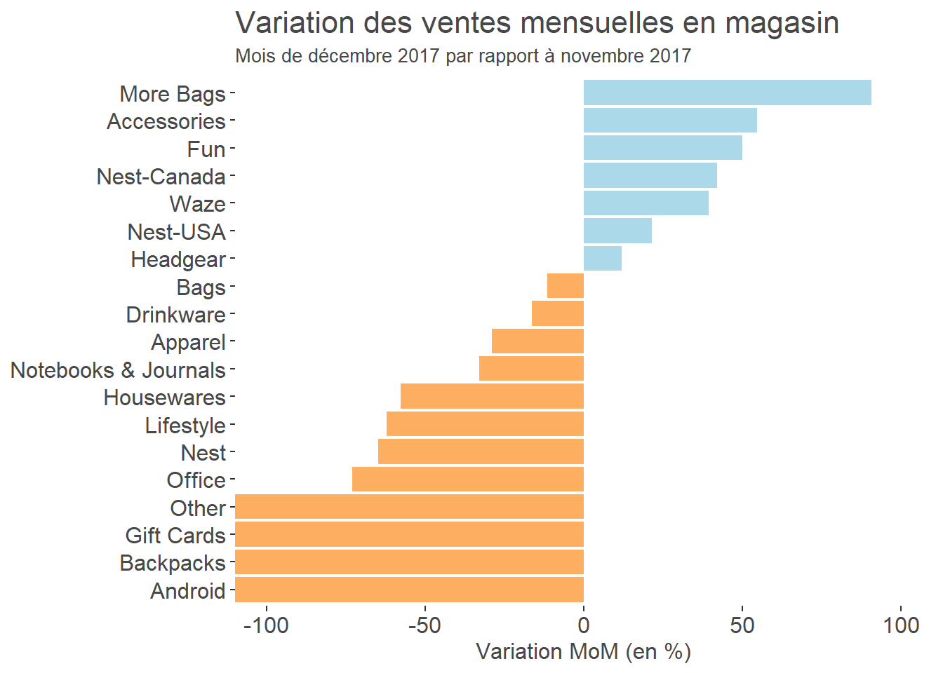
Now that we know our sales and growth by category, we would like to forecast the next month so we can set a sales target.
If you want to learn how to build time-series models, DataCamp offers an excellent course: Forecasting using R by Rob J. Hyndman, creator of the forecast package.
# Load forecast for predictive time-series models and xts for creating date-indexed objects more easily.
library(forecast)
library(xts)

# Calculate total daily revenue, including online and physical-store sales.
Revenue_daily <- Full_unique %>% group_by(Date) %>% summarize(sum(Revenue))

# Create a date sequence for the xts object.
dates <- seq(as.Date("2017-01-01"), length = 365, by = "days")

# Convert the object to xts format.
Revenue_daily <- xts(Revenue_daily$`sum(Revenue)`, order.by = dates)

# Create the predictive model automatically.
model <- auto.arima(Revenue_daily, stepwise = FALSE)

# Forecast the number of days in the current month.
fcast <- forecast(model, h = days_in_month(sysdate))

# Take a quick look at the forecast and predicted values.
plot(fcast)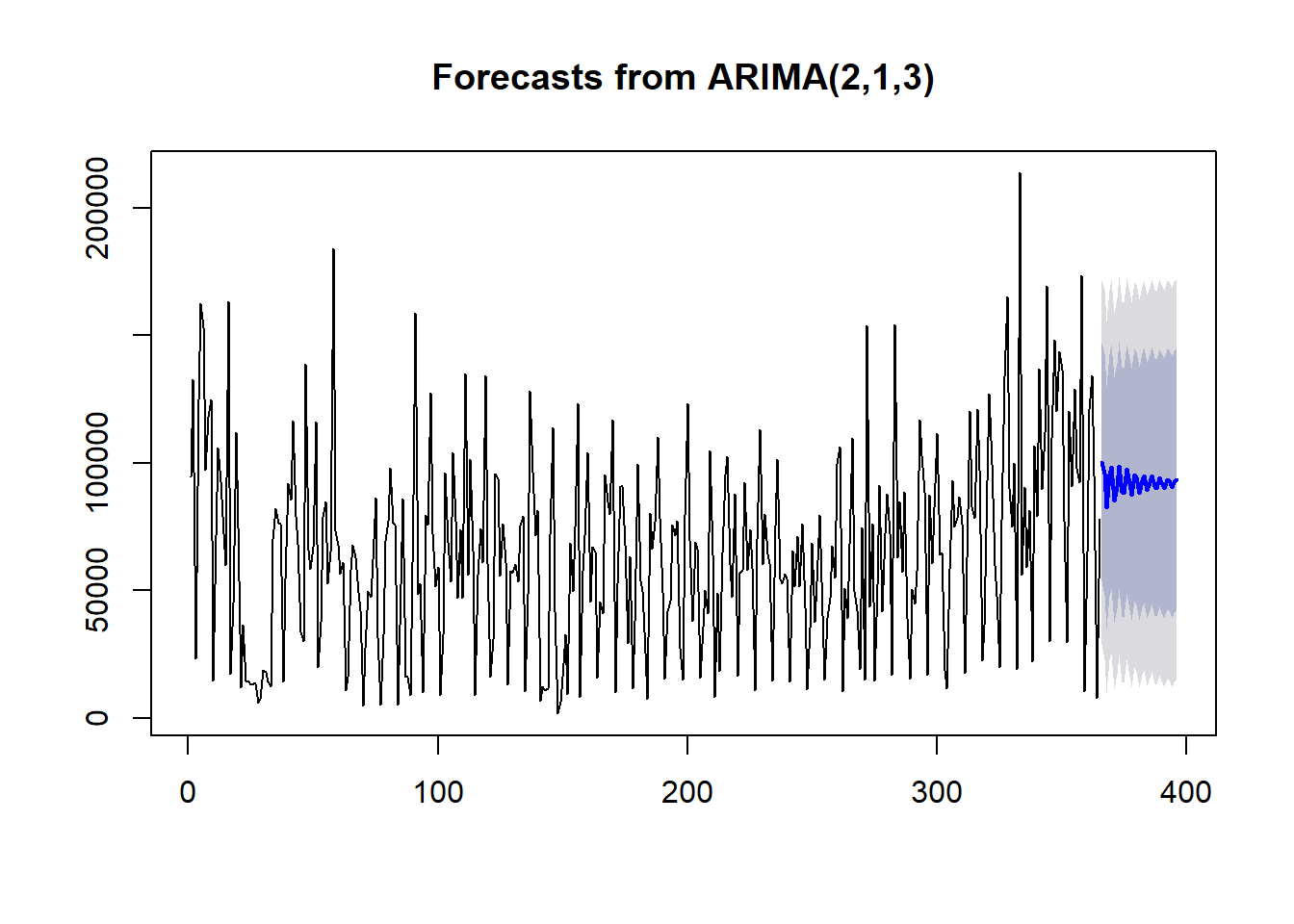
# Look at the mean forecast.
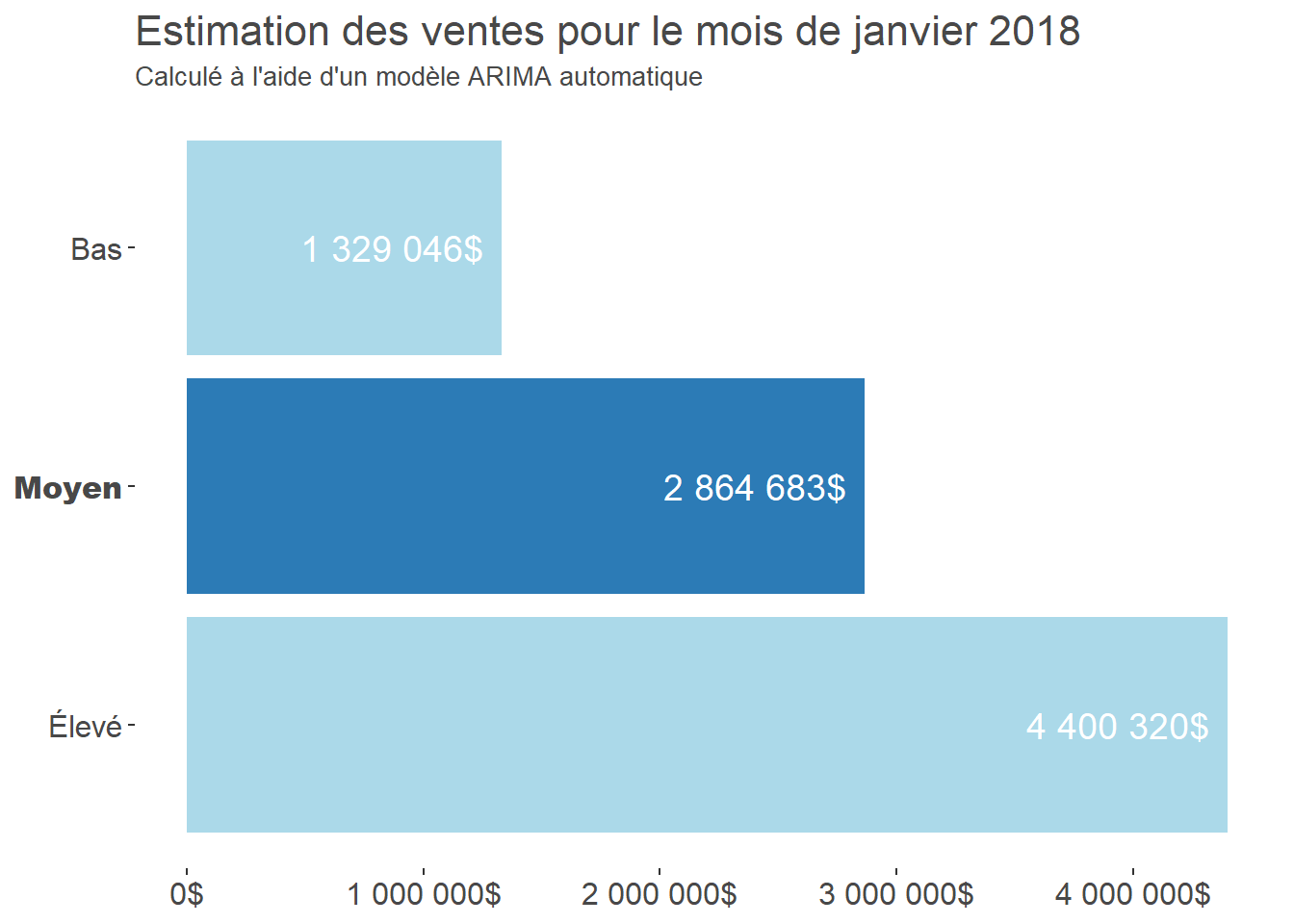
fcast$mean

## Time Series:
## Start = 366
## End = 396
## Frequency = 1
##  [1] 100409.10  95617.85  82661.92  95286.51  98492.79  85303.40  91042.45
##  [8]  98923.06  88758.51  88421.40  97584.02  91933.86  87538.74  95362.89
## [15]  94152.09  88053.42  93077.02  95182.81  89395.81  91298.83  95155.73
## [22]  90978.02  90295.77  94414.55  92341.67  90062.89  93365.82  93227.23
## [29]  90410.92  92360.72  93573.34

# Create the data table to visualize.
df <- data.frame(Low = sum(fcast$lower[,1]), Average = sum(fcast$mean), High = sum(fcast$upper[,1]))
df_long <- gather(df, key = "Estimate", value = "value")

# Format the figures as dollars.
dollar <- dollar_format(accuracy = 1, big.mark = " ", prefix = "", suffix = "$")

# Create the visualization.
ggplot(data = df_long, aes(x = Estimate, y = value, fill = Estimate, label = dollar(value))) +
  geom_bar(stat="identity", position = "dodge") +
  geom_text(hjust = 1.1, size = 5, color = "#ffffff") +
  coord_flip() +
  theme_tufte() +
  scale_y_continuous(labels = dollar) +
  scale_x_discrete(limits = c("High", "Average", "Low")) +
  scale_fill_manual(values = c("#abd9e9", "#abd9e9", "#2c7bb6")) +
  labs(title = (paste("Sales estimate for", format(as.Date(sysdate), "%B %Y"), sep = " ")),
       subtitle = "Calculated with an automatic ARIMA model") +
  theme(
    axis.title.x = element_blank(),
    axis.text.x  = element_text(family = "Arial", colour="#484848", size=12),
    axis.title.y = element_blank(),
    axis.text.y  = element_text(family = c("Arial", "Arial Black", "Arial"), colour="#484848", size=12),
    plot.title   = element_text(family = "Arial", colour="#484848", size=16),
    plot.subtitle = element_text(family = "Arial", colour="#484848", size=10),
    legend.position = "none"
) 
A time-series model alone will always leave a fairly large margin of error. We can instead create a linear regression model with ARIMA errors. Because we want to understand the association between advertising and sales, we will build this type of model with online and offline advertising-budget data, then make predictions using several scenarios.
# Import a file containing daily marketing spending for 2017.
Marketing_spend <- read_csv("Marketing_Spend.csv",
    col_types = cols(`Offline Spend` = col_double(),
        `Online Spend` = col_double(), X1 = col_date(format = "%Y-%m-%d")))

# Create three models by adding marketing budgets as regressors.
model_spend_both <- auto.arima(Revenue_daily, stepwise = FALSE, xreg = cbind(Marketing_spend$`Online Spend`, Marketing_spend$`Offline Spend`))

model_spend_online <- auto.arima(Revenue_daily, stepwise = FALSE, xreg = Marketing_spend$`Online Spend`)

model_spend_offline <- auto.arima(Revenue_daily, stepwise = FALSE, xreg = Marketing_spend$`Offline Spend`)

# Examine the fit of the models.
summary(model_spend_both)

## Series: Revenue_daily
## Regression with ARIMA(3,0,0) errors
##
## Coefficients:
##           ar1      ar2     ar3   intercept    xreg1   xreg2
##       -0.0879  -0.0553  0.0715  -24577.857  43.1001  2.6479
## s.e.   0.0523   0.0524  0.0529    2346.622   0.9302  0.7613
##
## sigma^2 estimated as 190771248:  log likelihood=-3994.55
## AIC=8003.11   AICc=8003.42   BIC=8030.41
##
## Training set error measures:
##                    ME  RMSE      MAE       MPE     MAPE      MASE
## Training set 8.370002 13698 11354.57 -12.31825 34.27963 0.3066989
##                      ACF1
## Training set -0.002404769

summary(model_spend_online)

## Series: Revenue_daily
## Regression with ARIMA(3,0,0) errors
##
## Coefficients:
##           ar1      ar2     ar3   intercept     xreg
##       -0.0579  -0.0164  0.1133  -18797.216  44.0179
## s.e.   0.0527   0.0524  0.0531    1899.972   0.9144
##
## sigma^2 estimated as 195942090:  log likelihood=-3999.95
## AIC=8011.9   AICc=8012.13   BIC=8035.3
##
## Training set error measures:
##                   ME     RMSE      MAE       MPE     MAPE      MASE
## Training set 8.96493 13901.72 11577.88 -13.89588 34.22336 0.3127307
##                      ACF1
## Training set -0.008030993

summary(model_spend_offline)

## Series: Revenue_daily
## Regression with ARIMA(0,1,4) errors
##
## Coefficients:
##           ma1      ma2     ma3     ma4     xreg
##       -0.9442  -0.1772  0.0047  0.1510  14.0375
## s.e.   0.0517   0.0723  0.0749  0.0534   1.6692
##
## sigma^2 estimated as 1.224e+09:  log likelihood=-4323.92
## AIC=8659.84   AICc=8660.07   BIC=8683.22
##
## Training set error measures:
##                    ME     RMSE      MAE       MPE     MAPE      MASE
## Training set 356.6522 34692.86 26926.26 -69.75817 96.22966 0.7273065
##                     ACF1
## Training set 0.005368986
The model with both regressors has the lowest AIC of the three models compared. In this fictional example, the coefficient associated with the offline marketing budget is 2.64, compared with 43.10 for the online marketing budget. These coefficients describe an association in the simulated data, not a causal effect of advertising on sales. The lower AIC favours this model among those compared, but does not by itself show that its predictions will be more accurate on new data.
Let’s create forecasts that include the planned marketing budget.
# Create tables containing budget-increase scenarios based on the previous month’s budgets.

Budget_same <- Marketing_spend %>%
                filter(X1 <= (ceiling_date(as.Date(sysdate %m+% months(-1)), "month") - days(1)) & X1 >= as.Date(sysdate %m+% months(-1)))

Budget_higher_online <- Marketing_spend %>%
                          filter(X1 <= (ceiling_date(as.Date(sysdate %m+% months(-1)), "month") - days(1)) & X1 >= as.Date(sysdate %m+% months(-1))) %>%
                          mutate(`Online Spend` = `Online Spend` * 1.25)

Budget_higher_offline <- Marketing_spend %>%
                          filter(X1 <= (ceiling_date(as.Date(sysdate %m+% months(-1)), "month") - days(1)) & X1 >= as.Date(sysdate %m+% months(-1))) %>%
                          mutate(`Offline Spend` = `Offline Spend` * 1.25)

# Create three forecasts using the three scenarios.
fcast_same <- forecast(model_spend_both, xreg = cbind(Budget_same$`Online Spend`, Budget_same$`Offline Spend`), h = days_in_month(sysdate))

fcast_higher_online <- forecast(model_spend_both, xreg = cbind(Budget_higher_online$`Online Spend`, Budget_higher_online$`Offline Spend`), h = days_in_month(sysdate))

fcast_higher_offline <- forecast(model_spend_both, xreg = cbind(Budget_higher_offline$`Online Spend`, Budget_higher_offline$`Offline Spend`), h = days_in_month(sysdate))

# Look at the forecasts. Which one seems most interesting?
plot(fcast_same)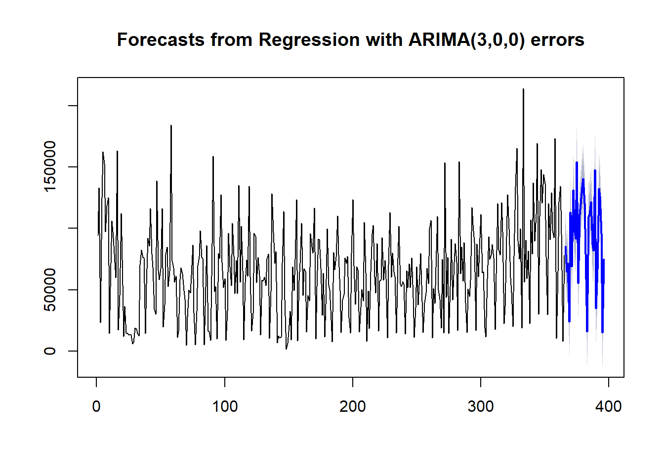
plot(fcast_higher_online)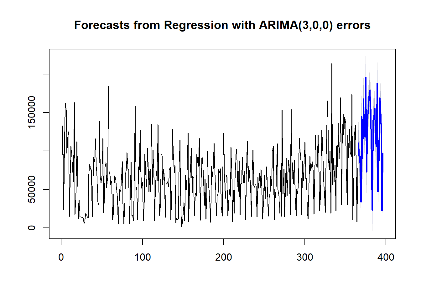
plot(fcast_higher_offline)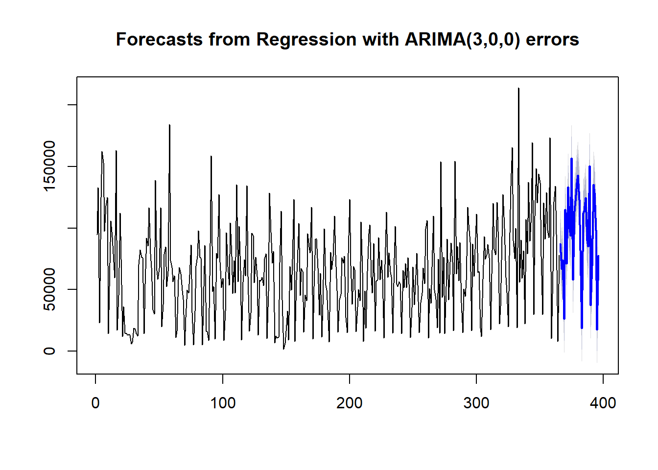
Now that we have forecasts for all three scenarios, we will visualize them. First, we will recreate our previous monthly sales estimate with the new model that includes marketing budgets.
# Create the data table to visualize.
df_same <- data.frame(Low = sum(fcast_same$lower[,1]), Average = sum(fcast_same$mean), High = sum(fcast_same$upper[,1]))
df_long_same <- gather(df_same, key = "Estimate", value = "value")

# Create the visualization.
ggplot(data = df_long_same, aes(x = Estimate, y = value, fill = Estimate, label = dollar(value))) +
  geom_bar(stat="identity", position = "dodge") +
  geom_text(hjust = 1.1, size = 5, color = "#ffffff") +
  coord_flip() +
  theme_tufte() +
  scale_y_continuous(labels = dollar) +
  scale_x_discrete(limits = c("High", "Average", "Low")) +
  scale_fill_manual(values = c("#abd9e9", "#abd9e9", "#2c7bb6")) +
  labs(title = (paste("Sales estimate for", format(as.Date(sysdate), "%B %Y"), sep = " ")),
       subtitle = "Marketing budget unchanged from the previous month",
       caption = "Linear regression of marketing budget on sales with ARIMA errors\n80% confidence level") +
  theme(
    axis.title.x = element_blank(),
    axis.text.x  = element_text(family = "Arial", colour="#484848", size=12),
    axis.title.y = element_blank(),
    axis.text.y  = element_text(family = c("Arial", "Arial Black", "Arial"), colour="#484848", size=12),
    plot.title   = element_text(family = "Arial", colour="#484848", size=16),
    plot.subtitle = element_text(family = "Arial", colour="#484848", size=10),
    plot.caption = element_text(family = "Arial", colour="#484848", size=8),
    legend.position = "none"
) 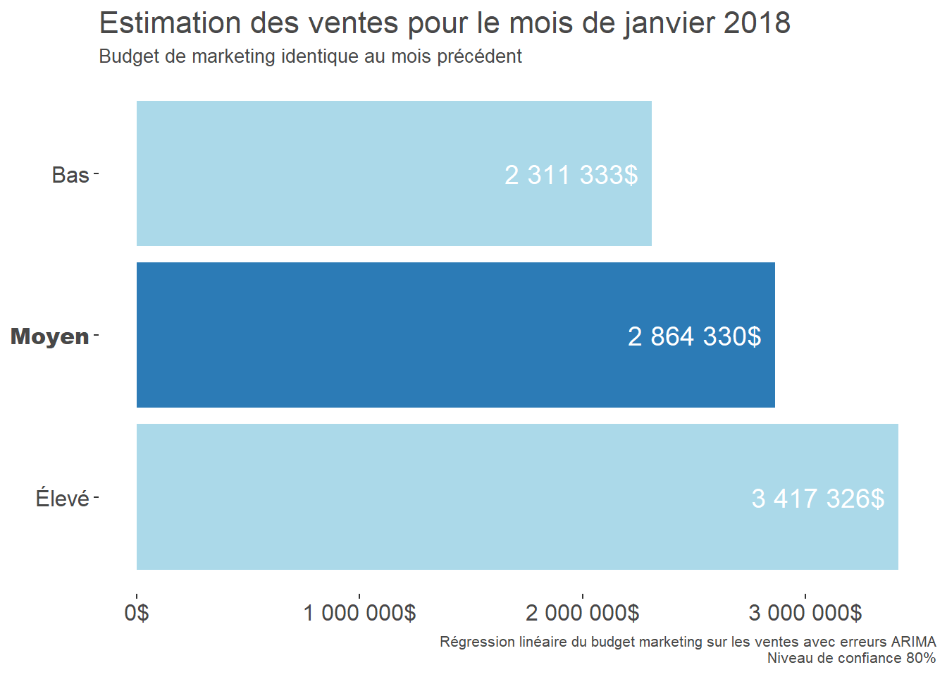
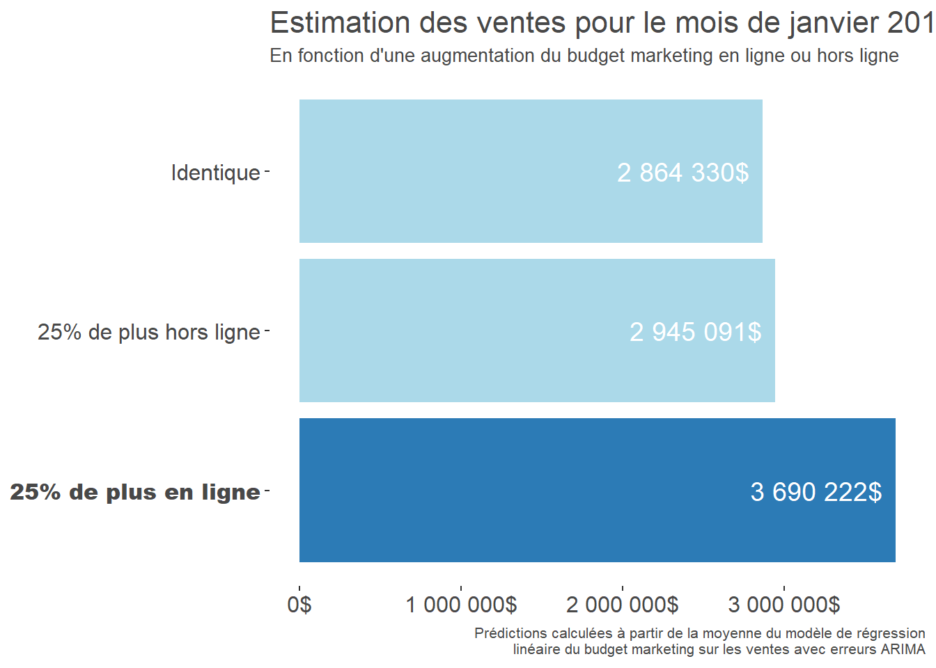
This estimate now accounts for the marketing budgets. Next, we create a visualization that places all three scenarios on one chart so they are easier to compare.
# Create the data table to visualize.
df_budget <- data.frame(Budget = c("Unchanged", "25% more online", "25% more offline"),
                        Average = c(sum(fcast_same$mean), sum(fcast_higher_online$mean), sum(fcast_higher_offline$mean)))

# Create the visualization.
ggplot(data = df_budget, aes(x = Budget, y = Average, fill = Budget, label = dollar(Average))) +
  geom_bar(stat="identity", position = "dodge") +
  geom_text(hjust = 1.1, size = 5, color = "#ffffff") +
  coord_flip() +
  theme_tufte() +
  scale_y_continuous(labels = dollar) +
  scale_fill_manual(values = c("#2c7bb6", "#abd9e9", "#abd9e9")) +
  scale_x_discrete(limits = c("25% more online", "25% more offline", "Unchanged")) +
  labs(title = (paste("Sales estimate for", format(as.Date(sysdate), "%B %Y"), sep = " ")),
       subtitle = "Based on an increase in the online or offline marketing budget",
       caption = "Predictions calculated from the mean of the linear regression model\n of marketing budget on sales with ARIMA errors") +
  theme(
    axis.title.x = element_blank(),
    axis.text.x  = element_text(family = "Arial", colour="#484848", size=12),
    axis.title.y = element_blank(),
    axis.text.y  = element_text(family = c("Arial Black", "Arial", "Arial"), colour="#484848", size=12),
    plot.title   = element_text(family = "Arial", colour="#484848", size=16),
    plot.subtitle = element_text(family = "Arial", colour="#484848", size=10),
    plot.caption = element_text(family = "Arial", colour="#484848", size=8),
    legend.position = "none"
) 
(Note 2026-09-02: This section documents a 2019 configuration. Debian 8, instance types, prices, interfaces and authentication methods have changed. Do not keep a service-account key in a project folder, and never write a password directly in code.)
Starting the Google Compute Engine instance
Now that we have all the reports we want to send each month, only two steps remain. First, we create an RStudio instance in Google Compute Engine. Second, we create a script on that instance that sends the report every month. Let’s begin by creating the RStudio instance with the googleComputeEngineR package.
The first step is to create a Google Compute Engine account. A credit card is required, but an f1-micro server was free. It was more than powerful enough for a task that would run once a month.
Next, create the project and retrieve the service-account details in JSON format: API Manager -> Credentials -> Create credentials -> Service account key -> Key type = JSON. Keep this file outside the working folder and project repository. It contains the credentials for the GCE account, so protect it and limit the service account’s permissions.
Then create a .Renviron file in the working folder, using a text editor, which R will load automatically at startup. It should contain the following:
GCE_AUTH_FILE = "C:/My First Project-168c949fa5ac.json" # Location of the JSON file created earlier.
GCE_DEFAULT_PROJECT_ID = "mineral-highway-236314" # Project ID for the "My First Project" created by Google, or another project if preferred.
GCE_DEFAULT_ZONE = "us-east1-b" # Server location, appropriate when connecting from the East Coast.
The code required to create the new GCE instance is extremely simple.
library(googleComputeEngineR)

vm <- gce_vm(template = "rstudio",
             name = "autoemailer", # Desired instance name
             username = "waq", # RStudio username
             password = Sys.getenv("RSTUDIO_PASSWORD"), # Password read from an environment variable
             predefined_type = "n1-standard-1") # Server type
The f1-micro was the only free server, but I used an n1-standard-1 at about $25 per month because the packages in the example exceeded the small f1-micro’s memory capacity.
(Note 2026-09-02: These instance types, free-tier eligibility and price reflect Google Cloud in 2019.)
Preparing the virtual-machine instance
First, install the packages that are not included in the base image. Before doing so, install Java and rJava through the instance’s terminal, which ran Linux Debian 8, because they are dependencies of the mailR package we will use to send email.
sudo apt-get install default-jdk
sudo apt-get install r-cran-rjava
sudo R CMD javareconf
Now we can install the packages:
install.packages("cronR")
install.packages("ggthemes")
install.packages("extrafont")
install.packages("miniUI")
install.packages("forecast")
install.packages("xts")
install.packages("mailR")
install.packages("rJava")
install.packages("shiny")
install.packages("shinyFiles")
And load them:
library(rJava)
library(cronR)
library(miniUI)
library(mailR)
library(readr)
library(tidyverse)
library(lubridate)
library(ggthemes)
library(scales)
library(extrafont)
library(forecast)
library(xts)
library(shiny)
library(shinyFiles)
To format dates correctly, create the en_US.UTF-8 locale, again in the terminal, with the appropriate utility:
sudo dpkg-reconfigure localesThen create a .Renviron file containing the locales to load when R starts:
LANG=en_US.UTF-8
LANGUAGE=
LC_CTYPE="en_US.UTF-8"
LC_NUMERIC="en_US.UTF-8"
LC_TIME="en_US.UTF-8"
LC_COLLATE="en_US.UTF-8"
LC_MONETARY="en_US.UTF-8"
LC_MESSAGES="en_US.UTF-8"
LC_PAPER="en_US.UTF-8"
LC_NAME="en_US.UTF-8"
LC_ADDRESS="en_US.UTF-8"
LC_TELEPHONE="en_US.UTF-8"
LC_MEASUREMENT="en_US.UTF-8"
LC_IDENTIFICATION="en_US.UTF-8"
LC_ALL=en_US.UTF-8
Finally, install and start the cron service in the terminal:
sudo apt-get install cron
sudo cron start
Creating the automated email script
I first created a shortened R Markdown version of the current file containing only the charts and a brief explanation of each one. I uploaded it directly to my GCE instance through RStudio. Next, upload all the files used so far. The easiest method is to copy them in a .zip file that will be extracted automatically when it arrives.
(Note 2026-09-02: Gmail authentication and the mailR package are presented as they worked in 2019. If you adapt this example today, use a currently supported authentication method and keep credentials out of the code.)
Once that is done, use the following script:
# Create the HTML report from the .rmd file.
rapport <- rmarkdown::render("Rapport_Mensuel.Rmd")

# Send the email.
mailR::send.mail(from = "xxxx@gmail.com",
          to = "xx@xxxxxx.com",
          subject = "Monthly performance report",
          body = "Rapport_Mensuel.html",
          html = TRUE,
          inline = TRUE,
          smtp = list(host.name = "smtp.gmail.com", port = 465, user.name = Sys.getenv("SMTP_USERNAME"), passwd = Sys.getenv("SMTP_PASSWORD"), ssl = TRUE),
          authenticate = TRUE,
          send = TRUE)
The final step is to select this script under Tools -> Addins -> cronR and choose the desired frequency!
That’s it. You will now receive up-to-date reports in your inbox without lifting a finger!